Key takeaways
- The colour wheel was developed by Isaac Newton in 1666 and refined by Johannes Itten into the practical tool used in personal colour analysis today
- Its 12 colours, 3 primary, 3 secondary and 6 tertiary, form the foundation of all colour harmonies
- Five core harmony types guide your choices: complementary, analogous, split-complementary, triadic and monochromatic
- Your personal undertone (warm or cool) determines which version of each harmony will genuinely flatter you
- The same principles apply equally to makeup choices, from foundation correctors to eyeshadow palettes
There is a reason some outfits just look right and others feel slightly off, even when all the individual pieces are perfectly nice. Colour harmony, or the lack of it, is almost always at the root. The colour wheel is the tool that makes those relationships visible and actionable. Whether you are putting together an outfit for a meeting in London or choosing an eyeshadow palette, understanding how colours relate to one another will sharpen every decision you make.
- What is the colour wheel and where does it come from?
- The structure of the colour wheel: primaries, secondaries and tertiaries
- The five essential colour harmonies
- Using the colour wheel for your outfits
- Applying the colour wheel to your makeup
- Common mistakes and how to avoid them
- Frequently asked questions
What is the colour wheel and where does it come from?
The colour wheel is a circular diagram that organises colours according to their natural chromatic relationships. The story begins in 1666 when Isaac Newton passed a beam of white light through a glass prism and discovered the visible spectrum. His crucial insight was to bend that linear spectrum into a circle, linking violet back to red, and the first colour wheel was born.
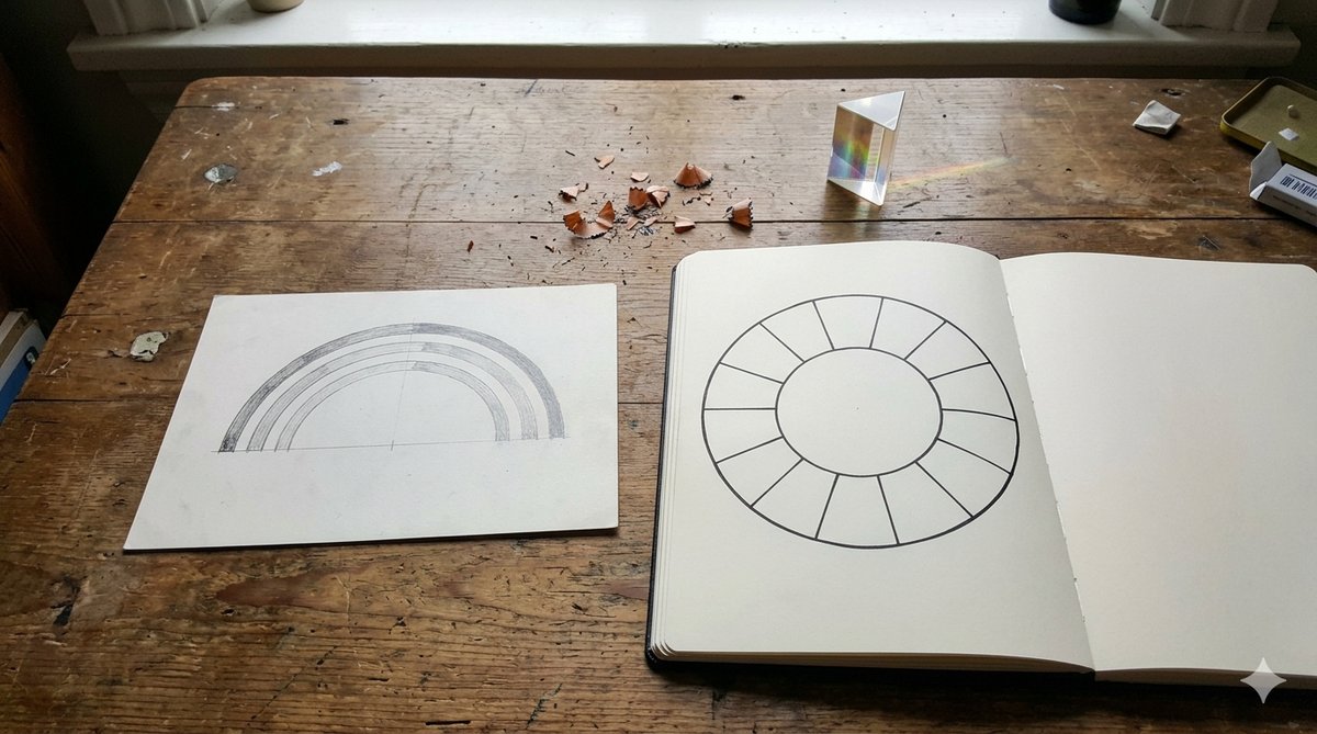
For centuries the wheel remained primarily a scientific curiosity. It was the Swiss artist and Bauhaus teacher Johannes Itten who, in the early 20th century, transformed it into a practical instrument for artists, designers and, eventually, personal stylists and colour analysts. Itten's 12-colour wheel remains the reference model used in colour analysis and fashion today.
His contribution went beyond the wheel itself: Itten identified the systematic relationships between colours on the wheel, the harmonies, and demonstrated how different colour combinations produce radically different psychological and visual effects. That foundation is exactly what personal colour analysis builds on when helping you identify your most flattering palette.
The structure of the colour wheel: primaries, secondaries and tertiaries
The wheel's power comes from its orderly structure. Three tiers of colour build outwards from one another in a logical progression.
Primary colours: the irreducible three
Blue (cyan), red (magenta) and yellow are called primary because no mixture of other colours can produce them. They are the pigment originals from which everything else derives. In a wardrobe context, primary colours read as bold and direct, a cobalt blue coat, a true red dress, a clear yellow accessory all make an immediate statement.
Secondary colours: the first round of mixing
Mix any two primaries in equal measure and you get a secondary:
- Orange = red + yellow
- Green = blue + yellow
- Violet = red + blue
On the wheel, each secondary sits precisely between the two primaries that created it, a spatial logic that makes the diagram intuitive once you understand it.
Tertiary colours: where nuance lives
A tertiary colour blends a primary with its nearest secondary neighbour. The six tertiaries are: red-orange, yellow-orange, yellow-green, blue-green, blue-violet and red-violet. These are the nuanced, complex tones, burnt sienna, sage, teal, plum, lavender, coral, that dominate most real-world wardrobes. If your personal colour palette sits in the cool-winter range, for instance, you will find yourself reaching for blue-violet and red-violet tertiaries far more often than the pure secondaries.
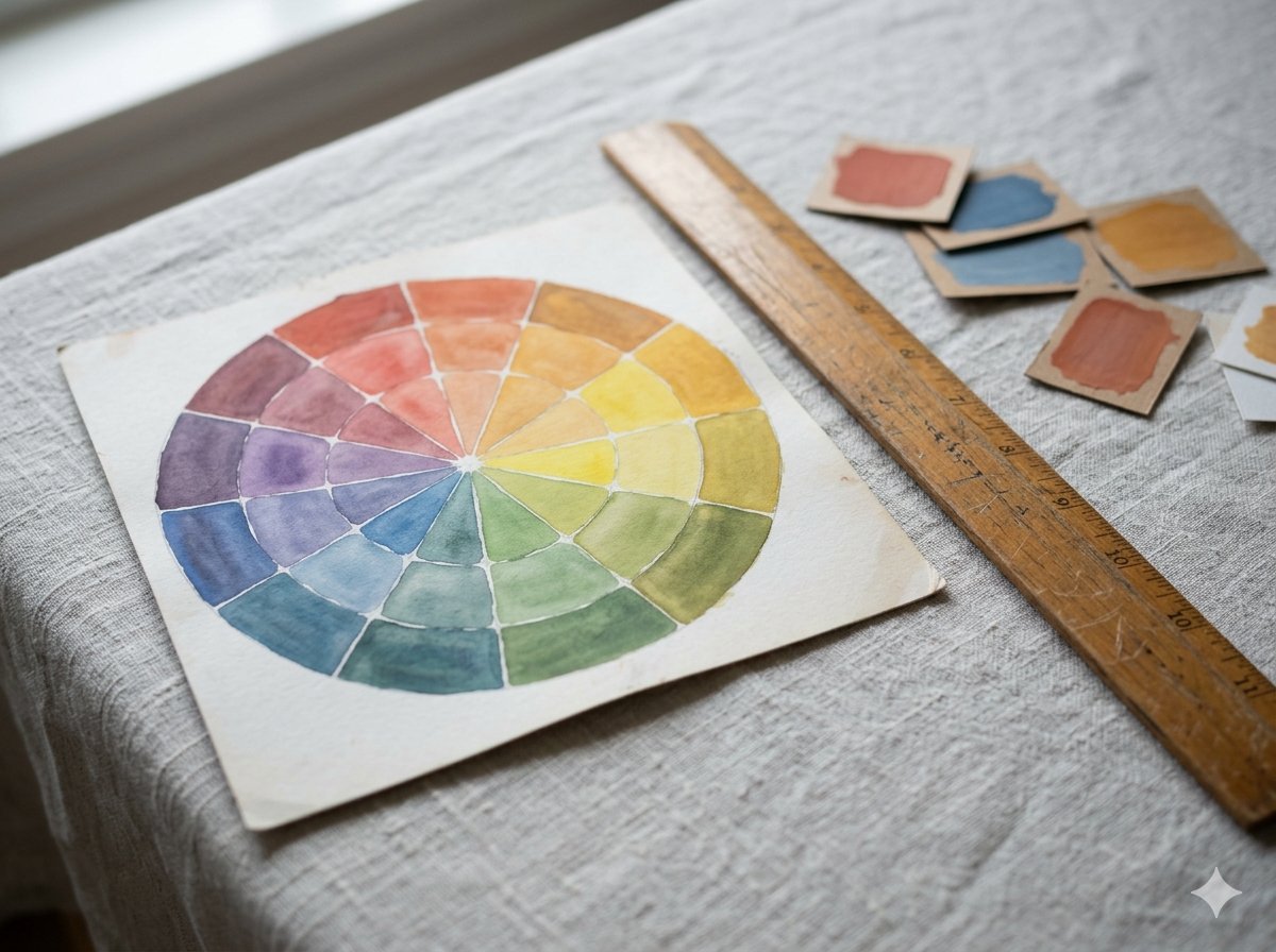

| Category | Colours | How they are made |
|---|---|---|
| Primary | Blue, red, yellow | Cannot be mixed from other colours |
| Secondary | Orange, green, violet | Equal mix of two primaries |
| Tertiary | Red-orange, yellow-orange, yellow-green, blue-green, blue-violet, red-violet | Primary mixed with its adjacent secondary |
The five essential colour harmonies
A colour wheel with no relationships mapped on it is just a chart. What makes it useful is the set of geometric rules that describe how colours interact when placed together. These five harmony types are the grammar of colour dressing.
1. Complementary colours: maximum contrast
Complementary pairs sit directly opposite each other on the wheel: blue and orange, red and green, yellow and violet. When placed side by side, complementary colours intensify each other, the contrast is as high as it gets on the wheel. This is the most visually dynamic harmony.
In practice, the trick is proportion. Pair 70% of one colour with 30% of its complement: a navy midi dress with a burnt-orange belt, or deep green trousers with a terracotta knit. Keep one side muted or tertiary to prevent the clash from reading as jarring rather than intentional.
2. Analogous colours: effortless cohesion
Three consecutive colours on the wheel form an analogous group, teal, blue and blue-violet, for example, or rust, red-orange and orange. The visual transition between them is natural because they all share a common parent. Analogous outfits read as polished and considered without appearing to try too hard. This is perhaps the most wearable everyday harmony.
3. Split-complementary: the intelligent compromise
Rather than picking the colour directly across the wheel, split-complementary selects the two colours flanking that opposite point. If your base is blue, instead of orange you choose red-orange and yellow-orange. You still get visual interest and contrast, but the tension is gentler than a full complementary pairing, a useful option when complementaries feel too bold.
4. Triadic harmony: dynamic balance
Three colours equally spaced around the wheel, forming a triangle, create a triadic harmony. The most classic triads are the primaries (red, blue, yellow) and the secondaries (orange, green, violet). Triadic outfits feel vibrant and energetic. To keep them wearable, let one colour dominate and use the other two sparingly, particularly in accessories.
5. Monochromatic: quiet sophistication
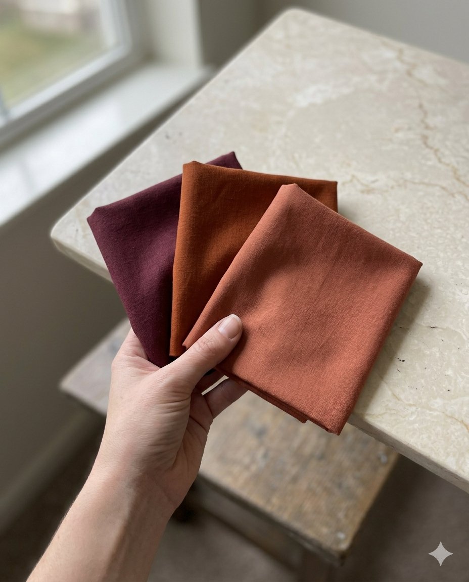
One hue, explored across a range of tints, shades and saturations. An all-burgundy look, rose blush at the collar, deep wine for trousers, dusty rose scarf, is inherently cohesive and visually elongating. The monochromatic approach works particularly well when the chosen hue aligns with your seasonal colour palette and personal undertone.
Using the colour wheel for your outfits
Theory becomes useful only when it informs decisions. Here is how to translate colour wheel principles into everyday dressing.
Know your undertone first
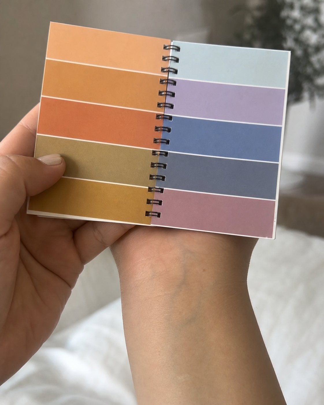
Before selecting harmonies, establish your personal undertone. Look at the veins on the inside of your wrist: green-leaning veins suggest a warm undertone; blue or purple-toned veins indicate a cool undertone. This single piece of information acts as a filter on the colour wheel, it tells you which version of each harmony will genuinely flatter you rather than merely coexist.
If you are uncertain about your seasonal type, a professional colour analysis consultation will map your full palette, saving considerable trial and error at the clothing rail.
The 60-30-10 rule
When building any colour-based outfit, a proportional rule prevents visual overload. Allocate roughly 60% of the look to a dominant colour (often a neutral or muted tone), 30% to a supporting colour, and 10% to a sharper accent. This creates a visual hierarchy that the eye can rest in without becoming exhausted.
"Your explanation of the colour wheel is exceptionally well done. But some people might get the idea they can wear any combination, no matter their hair or skin tone. That's why a colour consultation with a trained professional makes such a difference."
The role of neutrals
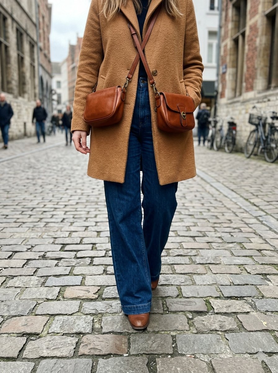
White, black, grey, navy and camel do not appear on the standard colour wheel, but they are the connective tissue of every successful wardrobe. A complementary pairing that feels too intense on its own often becomes elegant when a neutral piece is introduced between the two colours. A charcoal coat over an orange-and-blue outfit gives the eye a place to rest.
Adapting harmonies to your colour season
- Warm seasons (Spring, Autumn): choose the warm-inflected versions of each harmony, apricot orange rather than fluorescent orange, teal blue rather than icy blue
- Cool seasons (Summer, Winter): lean into the cool-inflected versions, raspberry red rather than brick, sage green rather than olive
Applying the colour wheel to your makeup
The same harmonic principles that guide your wardrobe translate directly into your makeup bag.
Colour correctors and the complementary principle
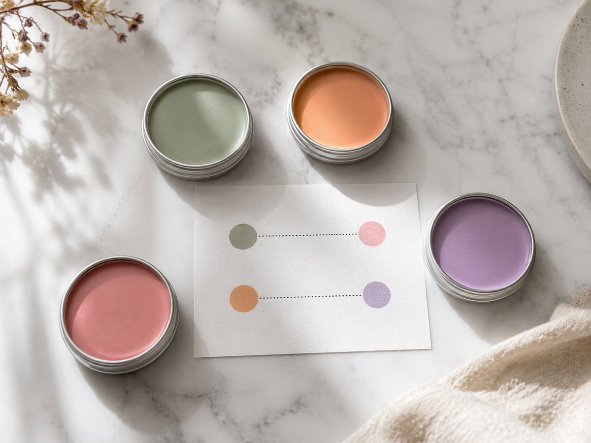
Colour-correcting concealers work precisely because of the complementary relationship on the wheel: a colour is cancelled by its opposite. This is why the corrector system makes sense:
| Skin concern | Corrector colour | Why it works |
|---|---|---|
| Redness, rosacea | Green | Green is complementary to red, it neutralises it |
| Dark or bluish under-eye circles | Peach or orange | Orange neutralises blue |
| Yellow or brown hyperpigmentation | Lavender or mauve | Violet neutralises yellow |
| Dull, ashy complexion | Soft pink or peach | Restores warmth and freshness |
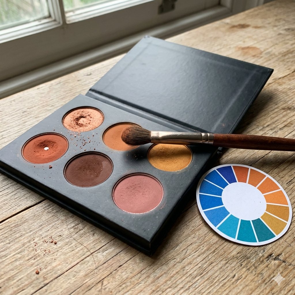
Eyeshadow and eye colour: using the complementary rule
To make your eye colour appear more vivid and defined, reach for eyeshadows in the complementary family of your iris colour:
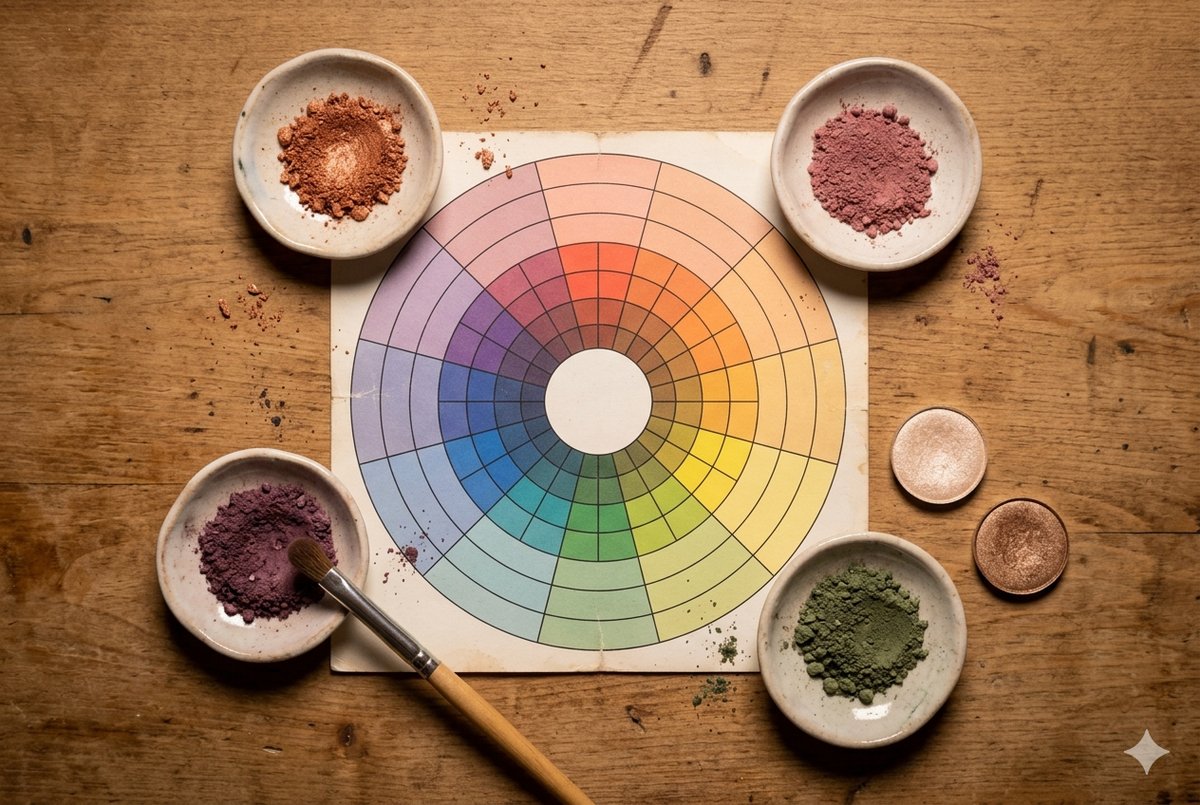
- Blue eyes: copper, amber, terracotta, warm bronze (all in the orange family)
- Green eyes: plum, burgundy, deep mauve, rose-violet
- Brown eyes: deep blue, violet, charcoal, the contrast with warm pigments in the iris makes the eye spring forward
- Hazel eyes: dual approach, violet tones activate golden flecks; copper and bronze intensify any green undertones
"The term 'cherry red' when it comes to lipstick has often confused me, it's used to describe both an electric bright pink-red and a darker Bing-like colour. They're really two different families: orange-red and blue-red."
Lip colour and your undertone
Lip colour selection follows your personal undertone rather than a strict complementary rule:
- Warm undertone: orange-reds, brick, coral, warm nude, caramel
- Cool undertone: berry, raspberry, blue-red, plum, cool pink
- Neutral undertone: rosy nudes, clear reds, dusty rose, you can pull from either register
Common mistakes and how to avoid them
"My instinct always pulled me towards darker colours. At my consultation I discovered I had been right all along, I just didn't know why. The lighter tones simply did less for me."
Ignoring undertone when building harmonies
A geographically correct harmony on the wheel can still look wrong if the colours' temperatures clash. Warm orange paired with icy blue creates dissonance even though they are genuine complementaries. Always filter your choices through your undertone once the harmony is identified.
Too many saturated colours at once
Wearing three or more fully saturated colours simultaneously overwhelms the eye and the outfit loses coherence. Dial one or two of the colours back to a muted or tonal version, dusty teal instead of vivid teal, muted rust instead of neon orange, to preserve the harmony without the overload.
Wearing black without thinking about contrast
Black is a neutral with a very high contrast value, which suits high-contrast colour seasons (Deep Winter, Clear Spring) perfectly. For soft or muted seasonal types, pure black next to the face can age and harden features. Navy, dark charcoal or deep chocolate brown deliver the grounding quality of black without the harshness.
"Imogen, these rules are quite eye-opening, I had never seen colour combinations as something with rules. I was wrong!"
Treating the wheel as a rigid rulebook
The colour wheel describes tendencies, not laws. If a combination that defies its geometry makes you look and feel extraordinary, wear it. The harmonies function as a reliable starting point and a diagnostic tool when something isn't working, not as a constraint on personal expression.
To explore further and get expert guidance on your personal colour combinations, browse our directory of certified colour analysis consultants across the UK, from London and Manchester to Edinburgh and Bristol.
Frequently asked questions
What is the colour wheel used for in colour analysis?
In personal colour analysis, the colour wheel maps the relationships between hues so you can identify which combinations will harmonise naturally and which will create unwanted contrast. It is used alongside your undertone assessment (warm, cool or neutral) to narrow down the specific versions of each colour that genuinely complement your natural colouring.
What are complementary colours on the wheel?
Complementary colours sit directly opposite each other on the wheel: red and green, blue and orange, yellow and violet. When paired together, they produce the maximum possible contrast, each colour appears more saturated and vivid in the presence of its complement. In practice, a 70-30 proportion between the two keeps the combination dynamic without being overwhelming.
How do I use the colour wheel to get dressed?
Start by identifying your personal undertone (warm or cool), then select a harmony type. For low-effort, reliable outfits, use analogous colours (three consecutive hues on the wheel). For more impact, experiment with complementary pairings using the 70-30 proportion rule. Always introduce at least one neutral piece to give the eye a resting point.
Can the colour wheel help me choose eyeshadow?
Yes, the most reliable eyeshadow strategy is to use the complementary colour of your iris. Blue eyes are intensified by orange-family shadows (copper, terracotta, amber); green eyes by the red-violet family (plum, burgundy); brown eyes by blue and violet tones. The contrast between complementaries makes the eye colour vibrate and appear more pronounced.
What is the difference between analogous and monochromatic colour schemes?
An analogous scheme uses three adjacent hues on the wheel, for instance, blue-green, green and yellow-green, creating a flowing, cohesive look. A monochromatic scheme uses a single hue across different shades, tints and saturations, for example, pale rose, dusty pink and deep burgundy. Analogous schemes feel richer and more varied; monochromatic ones feel quieter and more elongating.
What colours should I avoid if I have a cool undertone?
Heavily warm-toned shades, orange-based yellows, earthy terracottas, golden beiges, tend to appear discordant against cool-undertone skin, making it look washed out or sallow. The key is not to avoid the colour family entirely but to seek its cool-tinted version: dusty rose rather than coral, blue-based red rather than brick, cool lavender rather than warm peach.
How many colours should I wear at once?
Three is generally the practical maximum for a balanced outfit, typically one dominant, one supporting and one accent. Beyond three fully saturated colours, the visual noise increases and the outfit loses a clear focal point. Neutrals do not count towards this number, which is why experienced dressers often anchor colourful combinations in neutral separates.
Conclusion: making the colour wheel work in everyday life
The colour wheel gives structure to instinct. Once you understand that complementaries create vibration, that analogous tones flow naturally together and that monochromes build through variation in depth, the guesswork leaves your morning routine. The decisions become faster, and more of them land right.
The final piece is understanding that the wheel describes relationships between hues, it does not automatically account for your skin, eyes and hair. The intersection of colour harmony theory and personal colour analysis is where the real precision lives. When both are working together, every choice you make reinforces who you are and how you want to be seen.
If you would like professional guidance on your personal colour palette, our directory lists verified colour analysis consultants throughout the United Kingdom, available for consultations in person or online.